

The US Debt Problem
Source: Barchart (Data from Bloomberg, US Government)
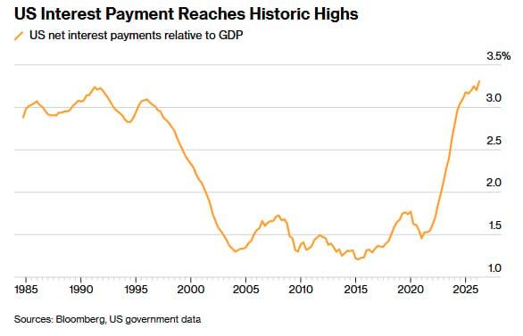
Well, the United States government is officially $40T in debt, and it also owes roughly $1T in interest on that debt. That’s a staggering statistic, isn’t it? US interest payments relative to GDP have more than doubled since early 2022, climbing to around 3.2% with no end in sight. The United States had an inflation problem, and the Fed had a solution, and that solution was interest rate hikes. That near-vertical spike back to historic highs was a direct result of that hiking period, as the government had to refinance and issue new debt at far higher rates. At first glance this may not look alarming, since 1985 to 1998 carried a very similar ratio, but that comparison is exactly what makes today so concerning. Back then, a ~3% interest burden made sense because rates themselves were high, with the 10-year Treasury often sitting at 6-8%. However, we’ve now climbed back to that same level with rates nowhere near those highs, and the reason is that the debt pile is enormously larger relative to the economy, roughly 120% of GDP today versus 40-60% back then. In short, we’re spending that same large share of a much bigger economy on interest, even with lower rates, because there’s simply far more debt to service. Back then, falling rates eased the burden, but this time, that relief looks more difficult to count on.
Gold’s Monetary Catch-Up
Source: Tavi Costa (Data from Bloomberg)
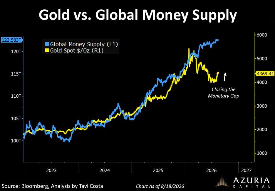
A lot of the charts I post relate to the investment thesis for gold and my views on it, because there are clear signs of the precious metal playing a larger role in monetary matters globally. This one is no different, showing a recent divergence between gold and global money supply that looks like an anomaly, with gold’s reversal now appearing to play catch-up. The argument is that gold and global money supply move together over time because gold is a hedge against monetary debasement. Think of it this way, central banks keep expanding the money supply, but the amount of gold in the world stays relatively fixed, so more money chasing the same scarce asset naturally pulls its price higher over time. If there’s any truth to that theory, gold should re-converge toward the expanding supply. Combine this with a declining dollar, which mechanically lifts a dollar-priced asset like gold, and there’s a reasonable case for at least a tactical position. Whether gold fully closes that gap is anyone’s guess, but the combination of monetary expansion, fiscal strain, and a softening dollar gives the metal more than enough to work with.
Private Credit and the Small Business Borrower
Source: Financial Times, Small Business Administration
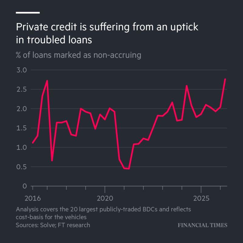
Private credit has been one of the hottest corners of the market for exposure to lending outside side of traditional banking systems, especially if you are a small to mid-sized business (SMBs). This matters because according to the SBA’s Office of Advocacy, small businesses represent almost every corporate entity in this nation of roughly 36.2 million businesses. That is 99.9% of all firms in this country that generate roughly 43.5% of U.S. GDP, but they never get the headlines that dominate this country’s news landscape like the conglomerates do. Lending to these companies carries a higher risk of default, and the chart above shows that the 20 largest publicly traded business development companies (BDCs), the firms that make many of these loans, are seeing a rise in loans marked “non-accruing.” Simply put, the borrower has stopped making payments on the principal or interest for 90 days or more. SMBs are typically borrowing on floating-rate terms, so rising rates or staying elevated cuts into their margins, which ultimately drives an uptick in non-accrual marked loans. This is not a sign of a crisis to be, but it can be an early crack in the foundation that these SMBs are starting to feel the real financial pressure.
Equity Sentiment – People Love Stocks
Source: Renaissance Macro Research
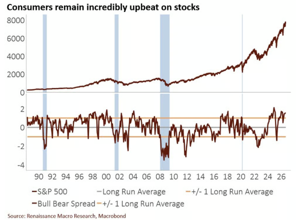
Personally, I don’t think there has ever been a point in history where consumers loved stocks as much as they do now. I believe one of the main variables to this is due to the fact that returns since 2019 (outside of 2022) have seen unprecedented growth and that is just referring to the S&P 500. There are countless individual stocks that have created unimaginable wealth for so many people, which is why you see such a difference in the average versus median wealth of Americans. As we stand, the S&P 500 is up ~14.0% for the year, and yet consumers are now +1 standard deviation above the bull/bear spread, meaning they are as optimistic about equities as they can get. When you take a step back, then this makes plenty of sense as regular consumers typically are most bullish after strong gains in the market, which in this case has been backed by the kind of earnings growth that often follows a market downturn. All charts can be interpreted in various ways, so when I view this on the behavioral side of things, I believe optimism is stretched and that the euphoric crowd of investors should remain on the side of caution. Consumer sentiment shouldn’t be used as a timing tool, since extreme optimism can persist, but it should be used to understand the level of complacency in the market especially when optimism reaches these levels.
Why Diversification Across Sectors Still Matters
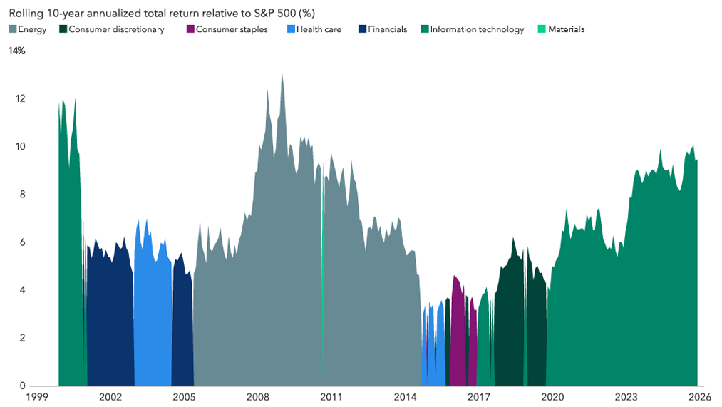
Source: Capital Group, RIMES, S&P Global
Let’s continue the conversation about equities but focus on it from a leading sector perspective. Since December of 1999, we have seen a collection of leading sectors relative to the S&P 500 with two trends being the most noticeable. The first is the energy sector outperformance from 2005 to 2014, which was a near decade of sector outperformance to the index as well as other sectors. This was largely driven by the Commodity Supercycle of 2000s that was fueled by rapid industrialization and raw material demand from foreign countries, specifically China. Energy stocks outperformed, but just like the rest of the stock market, it could not escape the events of the Global Financial Crisis. More relevant to us today is technology’s outperformance since 2019, driven by a multitude of stories we can simply summarize as the AI and mega-cap era. The meaning behind this chart is that no sector stays on top forever. Smart money tends to find its way to the corner of the market with the most favorable risk-reward characteristics, and there’s no reliable signal for when the next leader takes over. In fact, it’s often when the current leader feels most permanent that you’re most likely to be surprised by what comes next, so remain diversified across sectors, because none of us possess that magic eight ball.
DISCLOSURE
Past performance is no assurance of future results. Trademark Financial Management, LLC (“Trademark”) is a registered investment adviser with its principal place of business in the State of Minnesota. Trademark and its representatives are in compliance with registration requirements imposed upon investment advisers by those states in which Trademark operates. Trademark may only transact business in those states in which it is registered or qualifies for an exemption or exclusion from registration. This newsletter is limited to the dissemination of general information pertaining to its investment advisory/management services. Any subsequent, direct communication by Trademark with a prospective client shall be conducted by a representative that is either registered or qualifies for an exemption or exclusion from registration in the state where the prospective client resides. A complete list of all recommendations will be provided if requested for the preceding period of not less than one year. It should not be assumed that recommendations made in the future will be profitable or will equal the performance of the securities in this list. Opinions expressed are those of Trademark Financial Management and are subject to change, not guaranteed and should not be considered recommendations to buy or sell any security. For information pertaining to the registration status of Trademark please contact Trademark at (952) 358-3395 or refer to the Investment Adviser Public Disclosure web site (www.adviserinfo.sec.gov). For additional information about Trademark, including fees and services, send for our disclosure statement as set forth on Form ADV from us using the contact information herein or by calling 952-358-3395. Please read the disclosure statement carefully before you invest or send money. Any reference to a chart, graph, formula, or software as a source of analysis used by Trademark Financial Management staff is one of many factors used to make investment decisions for your portfolio. No one graph, chart, formula, or software can in and of itself be used to determine which securities to buy or sell, when to buy or sell them, or assist any person in making decisions as to which securities to buy or sell or when to buy or sell them. Any chart, graph, formula, or software used is limited by the data entered and the created parameters. The data was obtained from third parties deemed by the adviser to be reliable. Nonetheless, the adviser has not verified the results and cannot be assured of their accuracy.