

Bad Breadth, or Just a Breather?
Source: Schafer (Dow Jones Market Data, FactSet)
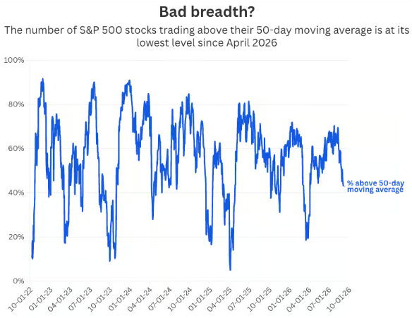
The S&P 500 market breadth is a strong chart to start this week’s Trademark Take off with, as ever since March 30th of this year, we saw an increase in the number of names that were trading above their 50-day moving average. In other words, about 20% of S&P 500 names were trading above that threshold, indicating oversold territory or a washed-out market, before reaching roughly 75% at its peak in June. Underlying holding participation is now weakening to about half of the index’s stocks, and this alongside the cap weighted index outpacing the equal weighted index confirms that larger names are starting to get the flows and attention from investors once again. Half the market is doing the work and propping up the cap weighted index, while the other half lags relative to previous performance, which is nothing out of the ordinary from what we have seen over the years. Investors tend to stress significantly more when the index keeps rising on shrinking participation, or when the index and participation drop together. An important caveat to this market indicator is the obvious large swings to the up and downside, so understand that pulling back the curtains on an indicator like this will give you the best impression of what we are actually experiencing. Sometimes it’s just noise in a choppy gauge, and other times it’s an early warning that the rally is running on fewer names. Either way, don’t overreact, just stay diversified across sectors, styles, and strategies.
Tech’s Profit Premium
Source: Callum Thomas (Topdown Charts, LSEG)
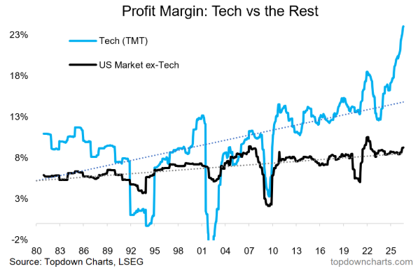
There are a couple of key takeaways from this chart, so let’s start with the most obvious one that is nearly impossible to miss. Technology (TMT – Tech, Media, Telecom) profit margins have surged dramatically over the past few years, sitting at roughly 23%, while ex-tech has slowly but surely continued its upward trend at roughly 9%. That is nearly a 3x profitability gap between the two, and it’s the widest dating back 45 years. These rising profit margins have played a large role in equity appreciation since 2022, but it is important to stay levelheaded and understand that the sustainability is quite fragile. Massive capex spending through equity and debt, rising power and energy costs, and more global competition are just a few of the larger contributors that can cause tech’s profitability to mean revert. I like to believe that we are seeing a structural shift in how semiconductors are viewed, but I will not strip away its cyclical nature just yet, and if that does turn out to be the case, then we may be near peak earnings growth if we are not already there. Now, the other takeaway is the less interesting, but equally important, ex-tech line that has shown remarkable stability while calmly grinding higher. When comparing the two, this is not a negative for ex-tech as it is actually above its historical average, therefore doing very well by its own historical standards.
No One Wins Every Year
Source: Guide to the Markets (JPMorgan)
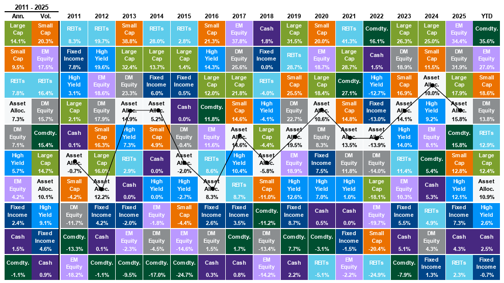
The asset class quilt is a chart that is simple, yet effective, when discussing diversification within a portfolio. It is a great representation of the performance of different asset classes and categories, ranking them from top performing to worst performing in a given calendar year. The “Asset Allocation” white square with the black line running through it is a diversified stock-to-bond-to-commodity blend, allowing investors to see how a so-called “balanced” portfolio performs alongside its peers. I discuss the need for diversification a lot, not just the typical 60/40 stocks and bonds, but a portfolio built on the idea that the non-controllable variables across our investable landscape change every single day. This year, commodities are leading the way with a staggering +35.6% as of 9/9/26, while large cap U.S. equities are underperforming four other equity categories, something that would have been very difficult to predict at the beginning of the year. Yet a lot of investors will still aim to be positioned in the category they think will outperform the rest, as the urge to chase returns has a stronghold on many. You are theoretically throwing a dart at this quilt blindfolded, and the odds are not with you. A portfolio constructed to your objective and risk tolerance through meticulous research and investment analysis is the route that will give you a better chance than the dart method over the long haul, and one that will give you greater peace of mind as you navigate through life.
College Sports’ New Economics
Source: BCA Research
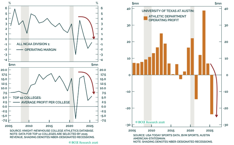
Football (American) is finally back, and if you are like me, then this is your favorite time of the year. Personally, I prefer the NFL over college, maybe that is because of fantasy leagues or maybe a different level of excitement than college possesses, who knows. Something that is becoming more prevalent in college sports is that the players want to be paid too, as college sports in general generate billions of dollars a year in total revenue. As you can see from the top left graph, operating margins are already relatively tight, which hover around 3-5%, but now with players getting a direct revenue share, the universities’ margins and profit have taken quite a hit. BCA Research highlights the University of Texas in the orange chart, and the newly agreed upon settlement of $20.5M per school for the 2025-2026 athletic year has already driven the athletic department’s operating profits to -$24.0M. One of the most profitable athletic departments that posted a record profit two years ago is now losing money. This structural regime change in college sports opens the door to much-needed changes: private capital equity injections, richer media rights deals, hiked ticketing and sponsorship deals, expanded playoffs, and so on. With private investment already involved in many professional sports teams, I believe we are not far from doing the same with collegiate sports through various fund vehicles.
The Print the Fed Needed
Source: Duality Research
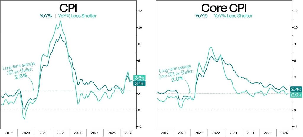
On Friday, September 11th, we got the CPI report, where prices rose 0.4% in the month of August, as expected. However, core inflation was higher than estimated, posting a 0.3% monthly gain, or 0.1% higher than what was forecasted. So, stripping out food and energy prices, prices grew more than expected, which gives the Fed an easier decision at next week’s FOMC meeting. The odds for a hike, according to the CME Group’s FedWatch tool, have now jumped to roughly 87% at the time of writing this. The Fed’s dual mandate is to promote two main economic goals: the first is maximizing employment and based on August’s Jobs Report that showed stronger-than-expected growth, this gives them the green light to focus on inflation (the second focus of the Fed). Many analysts believe the Fed is behind the curve again, and the bond vigilantes agree, to the point where they have aggressively pushed up yields to prove a point. When there is one force affecting the borrowing rates for our economy, you can expect another force to try and fight it, and that is what Treasury Secretary Scott Bessent has attempted to do. He announced a bond buyback program to push down rising long-dated yields (10-, 20-, and 30-year) and artificially ease stress on the long end of the curve, which to this day has not worked. Next week’s Fed decision is paramount to the market’s direction, but keep in mind that for both inflation and the Fed, the path matters more than the decision itself.
DISCLOSURE
Past performance is no assurance of future results. Trademark Financial Management, LLC (“Trademark”) is a registered investment adviser with its principal place of business in the State of Minnesota. Trademark and its representatives are in compliance with registration requirements imposed upon investment advisers by those states in which Trademark operates. Trademark may only transact business in those states in which it is registered or qualifies for an exemption or exclusion from registration. This newsletter is limited to the dissemination of general information pertaining to its investment advisory/management services. Any subsequent, direct communication by Trademark with a prospective client shall be conducted by a representative that is either registered or qualifies for an exemption or exclusion from registration in the state where the prospective client resides. A complete list of all recommendations will be provided if requested for the preceding period of not less than one year. It should not be assumed that recommendations made in the future will be profitable or will equal the performance of the securities in this list. Opinions expressed are those of Trademark Financial Management and are subject to change, not guaranteed and should not be considered recommendations to buy or sell any security. For information pertaining to the registration status of Trademark please contact Trademark at (952) 358-3395 or refer to the Investment Adviser Public Disclosure web site (www.adviserinfo.sec.gov). For additional information about Trademark, including fees and services, send for our disclosure statement as set forth on Form ADV from us using the contact information herein or by calling 952-358-3395. Please read the disclosure statement carefully before you invest or send money. Any reference to a chart, graph, formula, or software as a source of analysis used by Trademark Financial Management staff is one of many factors used to make investment decisions for your portfolio. No one graph, chart, formula, or software can in and of itself be used to determine which securities to buy or sell, when to buy or sell them, or assist any person in making decisions as to which securities to buy or sell or when to buy or sell them. Any chart, graph, formula, or software used is limited by the data entered and the created parameters. The data was obtained from third parties deemed by the adviser to be reliable. Nonetheless, the adviser has not verified the results and cannot be assured of their accuracy.