

The Stock-Bond Spread Near Its Historical Highs
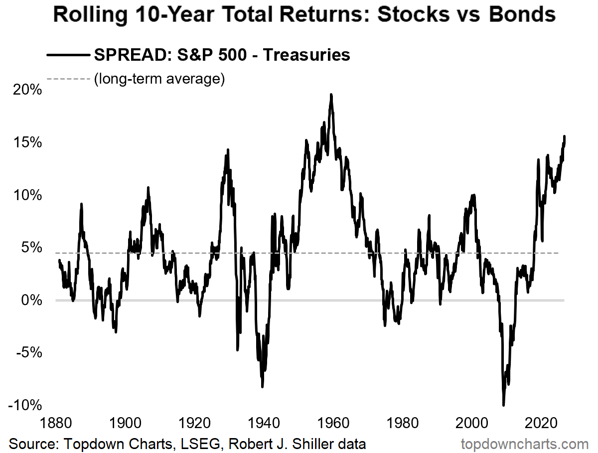
Source: Topdown Charts, LSEG, Robert J. Schiller Data
When you think about the growth potential of stocks and bonds, your mind probably jumps to stocks giving higher returns and bonds giving lower returns. More times than not that’s the case, and it should be, since stocks inherently carry more risk than bonds. The risk-reward conversation between the two asset classes is always being argued in this industry, and it will be for as long as critical thinking remains. Since the Global Financial Crisis, stocks have outperformed on a rolling 10-year basis, and the current reading sits among the highest in its entire history. Most of the time this spread has been above zero, meaning stocks have outperformed bonds, as shown by the gray dotted line marking the long-term average of ~5.0%. Over the last 15 years, plenty of people have pitched the “bonds are pointless” story, and while real returns for the broad bond market have struggled to stay afloat, that doesn’t mean the future of the asset class should be written off. Analytically speaking, this chart is mean-reverting, as every major peak has tended to be followed by a collapse in extreme stock outperformance. I want to emphasize this, we are arguably in one of the greatest stock bull markets in history, but that should not dismiss the case for owning bonds in a balanced portfolio. Stocks and bonds are both important, and a portfolio that thoughtfully combines the two is best positioned for a future that may rhyme with its historical patterns.
Agricultural Commodities Extend a Ten-Day Winning Streak
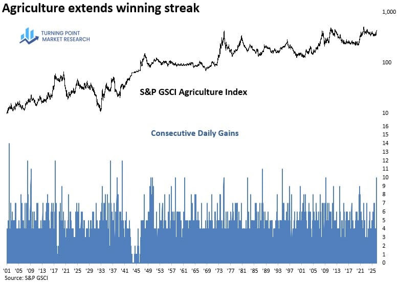
Source: S&P GSCI
The S&P GSCI Agriculture Index is up ~25.0% for the year with a large portion of the gains coming from these past few weeks. In fact, agricultural commodities are doing so well that they went on a streak of 10 days of consecutive daily gains, which has only happened a handful of times since 2000. The broad commodities index has done well this year with the closure of the Strait of Hormuz, which has left supply constrained, forcing energy costs upwards even as demand remains consistent. Agricultural commodities were trading range-bound for a good portion of this year, but geopolitical tensions are disrupting global trade, and adverse weather conditions alongside El Niño expectations are raising fears of tighter supply, pushing prices higher after months of consolidation. Another direct link to agricultural prices is the historical correlation between the commodity type and crude oil, where crude can both directly and indirectly impact farming input costs. Rising crude prices raise operational expenses for farmers, which places pressure on crop pricing and forces them to raise prices to stay above water. If you’ve positioned accordingly into commodities, you’ve benefited from this year’s strong performance, but it won’t be long before these higher input costs hit the grocery stores and affect your everyday spending habits.
Commodities and CPI Have Parted Ways
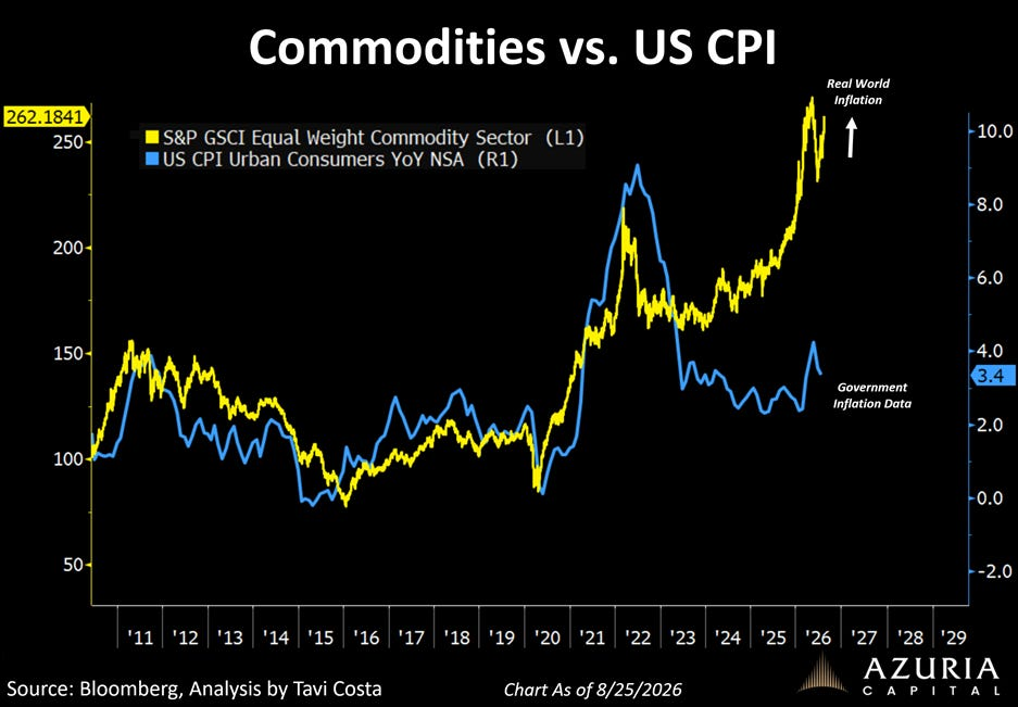
Source: Tavi Costa (Data from Bloomberg)
Inflation expectations continue to drive the majority of headlines as the Federal Reserve remains firm-footed on a 2.0% target. The chart above is one worth sharing, as it compares the S&P GSCI Equal Weight Commodity Sector (yellow) to the official U.S. CPI number (blue), showing quite the divergence between the two, which typically move hand-in-hand. Simply put, they are historically correlated, as commodities serve as one of the foundational inputs for the goods and services in the CPI consumer basket. Now, the argument being made is that “Real World Inflation” has been surging relative to “Government Inflation Data,” meaning the CPI print is understating the true inflationary pressure in the economy and what people experience day to day through grocery shopping, filling up their gas tanks, and even Minnesota State Fair prices (corn prices increased this year!). Let me preface this, the CPI print is not a manipulated or dishonest measurement by any means, it just tracks a broad basket of goods and services that moves more slowly. CPI is a lagging indicator weighted heavily toward shelter and services, whereas commodities are raw-material spot prices that reflect up-to-the-minute pricing. This divergence is an important trend to watch unfold, but commodities are a volatile asset class, and not every spike in price flows through to CPI.
From Expected Cuts to 2.5 Expected Hikes
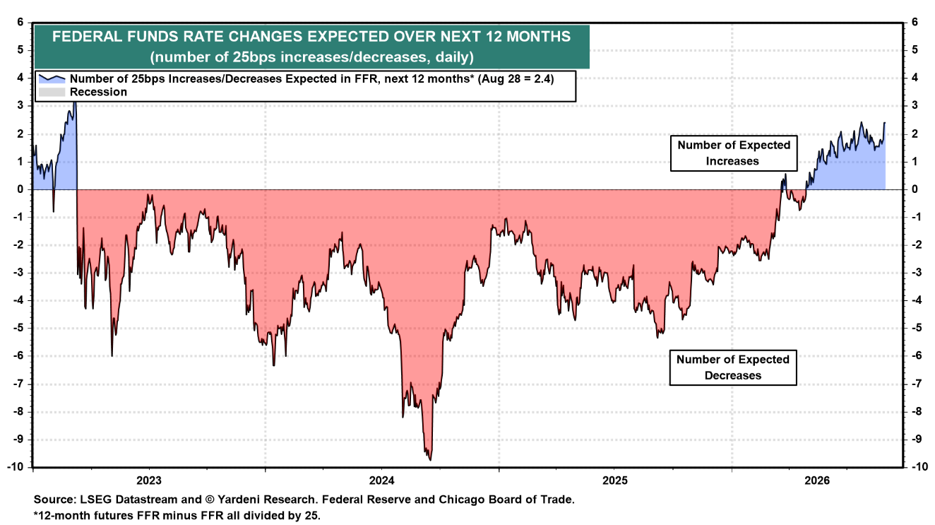
Source: Yardeni Research, LSEG Datastream
This is a Yardeni Research chart on market-implied Fed expectations over the next 12 months. It measures the number of 25bps rate changes the market expects the Fed to make over that time period. The storyline that has been dominant for two years has flipped, once expecting rate cuts alongside declining inflationary pressures, to now roughly 2.5 rate hikes due to the ongoing conflicts with Iran that have led to those pressures picking up once again. This Friday, September 11th, is going to be the deciding factor for the Fed’s next decision as a very important CPI print is scheduled for release, followed by the FOMC meeting on September 15-16 the following week. The probabilities of what the Fed is going to do changes on a daily basis, and with the jobs report showing a surge in hiring, it allows the Fed to once again steer its focus to inflation (CME FedWatch is pricing in a 60% chance of a rate hike), but let’s not jump on the ship until the subsequent CPI numbers give us a better understanding. What I believe is more important is the direction of the Fed’s path rather than the number of expected rate changes, as these expectations do not have a strong track record over the long term (nearly 10 cuts in 2024), so viewing it as a shift in sentiment rather than a forecast will save you from trying to predict the future that is so hard to do.
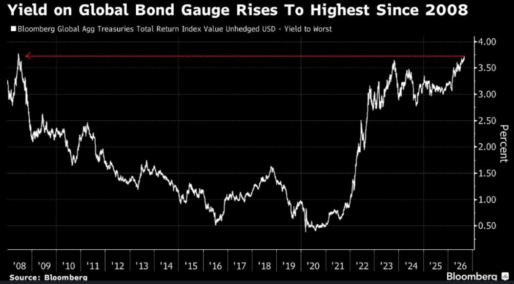
Global Yields Are Back at 2008 Levels
Source: Bloomberg
For the last chart, I want to focus on yields from the Bloomberg Global Aggregate rather than just long-duration U.S. yields. The white line is the yield-to-worst, the lowest potential return an investor can expect from the global bond market (without issuer default), calculated by working through all potential payout scenarios, with call features being the most common. As you can see, we’re back at 2008 levels after a decade-plus era of falling rates and QE that pushed yields to extreme lows and paid bondholders nearly nothing. The U.S. makes up roughly 40.0% of this index, so its path looks very close to our own broad bond market, but that’s only one piece of the puzzle behind this large run-up in global yields. The other ~60.0% is comprised of numerous countries that tend to show strong correlation with U.S. Treasuries, given that Treasuries are regarded as the global risk-free benchmark that anchors the entire fixed-income system. A highly integrated system, combined with global central banks facing the same macro drivers as they fought the same inflation shock, became a one-two punch that sent U.S. and sovereign yields rising together at an unforeseen pace. The path has been painful for existing holders, as rising yields have beaten down the price of their bonds, but the risk-reward case for new buyers only continues to look more attractive.
DISCLOSURE
Past performance is no assurance of future results. Trademark Financial Management, LLC (“Trademark”) is a registered investment adviser with its principal place of business in the State of Minnesota. Trademark and its representatives are in compliance with registration requirements imposed upon investment advisers by those states in which Trademark operates. Trademark may only transact business in those states in which it is registered or qualifies for an exemption or exclusion from registration. This newsletter is limited to the dissemination of general information pertaining to its investment advisory/management services. Any subsequent, direct communication by Trademark with a prospective client shall be conducted by a representative that is either registered or qualifies for an exemption or exclusion from registration in the state where the prospective client resides. A complete list of all recommendations will be provided if requested for the preceding period of not less than one year. It should not be assumed that recommendations made in the future will be profitable or will equal the performance of the securities in this list. Opinions expressed are those of Trademark Financial Management and are subject to change, not guaranteed and should not be considered recommendations to buy or sell any security. For information pertaining to the registration status of Trademark please contact Trademark at (952) 358-3395 or refer to the Investment Adviser Public Disclosure web site (www.adviserinfo.sec.gov). For additional information about Trademark, including fees and services, send for our disclosure statement as set forth on Form ADV from us using the contact information herein or by calling 952-358-3395. Please read the disclosure statement carefully before you invest or send money. Any reference to a chart, graph, formula, or software as a source of analysis used by Trademark Financial Management staff is one of many factors used to make investment decisions for your portfolio. No one graph, chart, formula, or software can in and of itself be used to determine which securities to buy or sell, when to buy or sell them, or assist any person in making decisions as to which securities to buy or sell or when to buy or sell them. Any chart, graph, formula, or software used is limited by the data entered and the created parameters. The data was obtained from third parties deemed by the adviser to be reliable. Nonetheless, the adviser has not verified the results and cannot be assured of their accuracy.